


10
November
,
2026

Georgia Hull
More information doesn't always mean more sales. In fact, your landing page could be losing customers because you're telling them too much.
You've spent money getting people to your website. Your ads are attracting clicks, your landing page is receiving visitors, but not enough people are enquiring, booking or buying.
The natural reaction? Add more information.
More benefits. More product details. More options. More reasons to buy.
But what if the solution is actually to remove information?
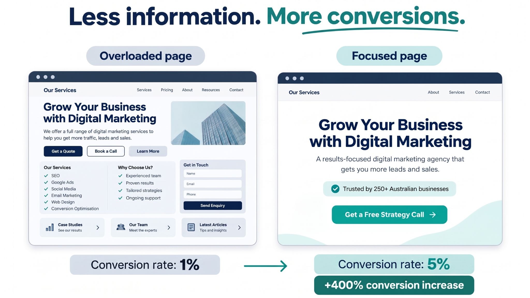
At Walk Digital, we've seen how simplifying a landing page can make a significant difference to conversion rates. In one client example, simplifying the page was associated with a conversion rate increase from approximately 1% to 5%.
That's a 400% increase in conversions, without needing to attract more visitors.
The good news is you don't necessarily need a website redesign to improve your results. You can audit your landing page, identify the biggest problems and make practical changes in a single day.
Here's how.
When someone clicks your advertisement, they're usually looking for a solution to a particular problem.
Imagine you're running a physiotherapy clinic and advertising treatment for lower back pain.
Your ad says:
"Struggling with Lower Back Pain? Book an Assessment With Our Physio Team."
The visitor clicks because the message addresses their problem.
But when they arrive on your landing page, they're presented with:
Suddenly, they're having to work out what to do next.
This is where too many choices and competing messages can create friction.
Instead of helping the visitor make a decision, the landing page creates more work for them.
Your landing page should make the next step easier, not harder.
Research supports the value of clear, accessible landing page content.
According to Unbounce's 2024 Conversion Benchmark Report, which analysed more than 41,000 landing pages and 57 million conversions:
The message is straightforward: making your landing page easier to understand is a sensible place to start.
Here's an example from our experience at Walk Digital.
We worked with a client whose landing page performed significantly better when we simplified the messaging and focused on one clear action.
When the page was kept simple, the conversion rate reached approximately 5%.
When additional information and options were added, the conversion rate fell back towards 1%.
Simplifying the page again was associated with the conversion rate recovering.
To understand what that difference means, imagine the page receives 1,000 visitors.
That's 40 additional leads from the same number of visitors, representing a 400% increase in conversions and an 80% reduction in cost per lead.
The figures illustrate the difference between a 1% and 5% conversion rate at the same advertising spend. The conversion rates reflect our client experience; the visitor numbers and advertising costs are illustrative.
Not every landing page will achieve this result, and changes should be tested against actual performance. However, the example shows why improving your existing traffic's conversion rate can be more effective than simply spending more to attract additional visitors.
You don't need to be a developer or marketing specialist to complete this audit.
Open your most important landing page, ideally one you're currently sending paid advertising traffic to, and work through these seven checks.
The test: Can someone understand who your landing page is for and what problem you solve within five seconds?
Your headline should connect directly to the reason someone clicked your advertisement.
"Welcome to Our Allied Health Clinic. We Offer a Wide Range of Professional Healthcare Services."
"Struggling With Lower Back Pain? Get Help From Our Experienced Physio Team."
The second example immediately addresses the visitor's concern.
Your action: Rewrite your headline to focus on the specific customer problem and the outcome they're seeking.
The test: Does your landing page continue the same conversation your advertisement started?
If someone clicks an advertisement about lower back pain, the landing page should focus on lower back pain.
Not sports injuries, rehabilitation, massage, occupational therapy and every other service you offer.
Your action: Compare your ad headline with your landing page headline. Make sure they're talking about the same problem and solution.
The test: Count how many different actions someone can take on your page.
Can they book an appointment, download a brochure, browse your services, read your blog, subscribe to your newsletter and contact your team?
Each additional option potentially distracts from the primary conversion goal.
"Learn More | View Services | Meet Our Team | Download Brochure | Contact Us"
"Book Your Physio Assessment"
Your action: Choose one primary conversion goal and make it the most prominent action throughout the page.
You can repeat the same call to action in multiple sections without introducing competing goals.
The test: Can you remove any content without making it harder for someone to decide?
Customers usually need answers to four questions:
If your page contains long explanations, repeated benefits or information unrelated to these questions, consider removing or shortening them.
Your action: Review every section and ask whether it helps someone make a decision. Remove unnecessary content, but retain essential details such as pricing, conditions and information needed to make an informed choice.
The test: Have you given visitors a reason to believe you can deliver what you promise?
Trust doesn't require multiple paragraphs about your business.
Depending on your service, it could be demonstrated through:
Your action: Add one or two pieces of credible, relevant evidence close to your main call to action.
The test: Are you requesting information you don't actually need at this stage?
For example, if the goal is to book an initial consultation, you may only need someone's name, email address and contact number.
Requesting extensive background information before someone can enquire might discourage them from completing the form.
Research from the Baymard Institute found that 17% of surveyed online shoppers had abandoned a checkout because it was too long or complicated.
Although this research specifically concerns ecommerce checkouts rather than lead generation landing pages, it reinforces the need to examine unnecessary form complexity.
Your action: Remove optional fields that aren't required for the next step. Keep essential fields needed for qualification, safety or compliance.
The test: Open the page on your phone and try to complete the intended action.
Check whether:
Your action: Fix the most obvious usability issues, particularly anything preventing visitors from completing your form or booking.
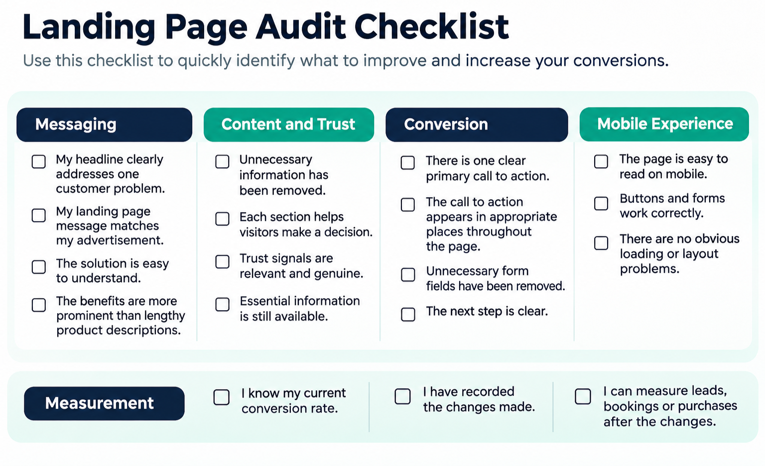
You don't need to fix everything at once. Start with the changes most likely to remove confusion and make the next action easier.
Total: 4 hours.
Allow additional time if your website requires development work or internal approval.
Before making changes, record three things:
Use this formula:
Conversion Rate = (Conversions ÷ Visitors) × 100
For example:
50 leads ÷ 1,000 visitors × 100 = 5% conversion rate.
After updating the page, monitor these same metrics.
If your conversion rate increases from 5% to 7.5%, you've increased conversions by 50% at the same traffic volume.
That's already a meaningful result, even without achieving the 400% improvement in our earlier example.
Be aware that one day's worth of data may not be sufficient to confirm success. Traffic quality, campaign changes and seasonal demand can affect results. Where practical, run an A/B test that compares the original landing page with your simplified version, and allow sufficient data to accumulate.
Also monitor lead quality and actual sales, not just form submissions.
If your landing page isn't converting, adding more advertising budget isn't necessarily the answer.
Your visitors may already be interested. They might simply be finding it difficult to work out what they should do next.
The best place to start is with a clear, focused message:
Show visitors you understand their problem. Explain how you can solve it. Give them a reason to trust you. Then make the next step obvious.
Set aside a few hours, complete the checklist and simplify your landing page.
You might be surprised by how much information you can remove, and how much easier that makes it for customers to convert.
At Walk Digital, we help businesses improve the customer journey from the first advertising click through to enquiry and sale.
If your ads are bringing visitors to your website but those visitors aren't converting, we can help identify where potential customers are dropping off and what changes could improve performance.
A good landing page conversion rate depends on your industry, target audience, traffic source and the action you want visitors to take. According to Unbounce's 2024 Conversion Benchmark Report, the median landing page conversion rate across industries was 6.6%.
Rather than focusing solely on industry benchmarks, compare your landing page's performance over time and look for opportunities to improve it.
Yes. Too much information can overwhelm visitors and make it harder for them to decide what to do next. When a landing page includes lengthy explanations, multiple offers and competing calls to action, visitors may leave without converting.
Focus on one customer problem, explain your solution, provide evidence that builds trust and make the next step clear.
Start by reviewing your headline, messaging, calls to action and enquiry forms. Remove unnecessary information, make sure your landing page matches your advertising message and simplify the steps needed to enquire or purchase.
These changes can help you generate more conversions from your existing website traffic without increasing your advertising budget.
You can audit and update a landing page in a single day. Simple changes such as rewriting headlines, shortening forms and removing competing calls to action can often be completed within a few hours.
However, you'll need to monitor performance over time to determine whether those changes have improved your conversion rate.
It's possible, but results vary. At Walk Digital, we've seen a client's landing page conversion rate increase from approximately 5% to 25% when the page was simplified.
That's a 400% increase in conversions from the same amount of traffic, or five times as many leads.
Not every business will achieve this result, but it demonstrates how removing unnecessary information and focusing on one clear action can make a substantial difference.
Ideally, a campaign-specific landing page should focus on one primary conversion goal, such as booking an appointment, requesting a quote or making a purchase.
You can repeat the same call to action throughout the page so visitors can take the next step when they're ready. Avoid introducing multiple competing actions that distract from your main goal.



Georgia is a marketer with over 15 years specialising in automation, driving revenue and brand awareness. Achieving growth by implementing strategies designed to drive customers to action from first contact along a journey through repeat purchase then on to passionate advocacy. She has experience working in challenging industries delivering consistent increased revenue and profits, with a focus on exceeding targets.
Specialties: Digital Advertising, marketing automation, segmentation and personalisation, content strategy, customer nurture, customer journey mapping, digital strategy, conversion tracking, database acquisition, CRM, process management, analytics.