


04
July
,
2025
•
Chris Walker
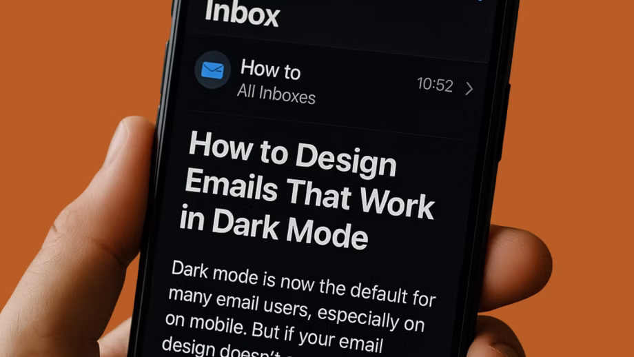
For many users, dark mode is now the default for their devices. This is especially true on mobile where up to 80% of Android users surveyed reported a preference for dark mode. But if your email design doesn’t account for it, your message might be unreadable or look broken.
In this article, we’ll show you why dark mode causes display issues, what email platforms do with colours and fonts when dark mode is enabled, and how you can avoid common design mistakes.
While each device and email client handle dark mode differently, there are a few design tricks you can use to avoid the most egregious issues in your emails.
Dark mode is a setting used to decrease bright white light in digital displays, reducing eye strain for the user with the added bonus of consuming less battery.
In dedicated apps and websites, this is achieved by designing a secondary colour palette that darkens backgrounds and brightens content elements like text, allowing careful control of readability and brand identity.
Unfortunately, when it comes to email, it’s rare to have this level of functionality.
For the most part, dark mode is not an optional feature you can disable for your emails. It’s a software feature offered by most email clients, and they each have unique methods of attempting to automatically achieve a dark mode version of whatever email they are displaying.
This means that not only can you not disable dark mode, but you can’t ignore it either. Being aware of how the major clients adjust an email to accommodate dark mode allows you to design your emails in ways that make the task easier.
However, it is always important to test send your email and check on a dark mode enabled device before finalising your design.
The trouble with dark mode comes from the variety of methods each email client uses to darken content automatically. Some email clients will invert all the colours in your email, others will only do so partially, or have a more intelligent method of darkening the content.
Understanding what these platforms detect and change is the key to a dark mode friendly design.
Stick to pure black for text wherever possible. Gmail and other clients reliably invert black text to white, giving you some predictability in how your design will be converted. Be cautious of mid-tone colours, like grey, as they often invert poorly, appearing washed-out or nearly invisible when dark mode is applied.
Email clients will often adjust coded background colours in dark mode. If you want a specific colour to display exactly as intended regardless of dark mode, use a solid-colour PNG image instead. Since image colours can’t be modified by most clients, this is the most reliable way to control background appearance.
Link colours are also affected when viewed in dark mode and can flip unpredictably. Lighter blues or purples might invert to colours that are too dark or too bright, making them difficult to read or easily missed. Choose link colours that still maintain clear contrast when inverted and test them on dark mode devices before finalising.
Using in-CRM previews isn’t enough to be confident in how your email will look when viewed with dark mode enabled. Since different platforms and devices handle dark mode differently, it’s best to send test emails and check them on Gmail on Android and iOS, and Apple Mail on iOS at a minimum.
Dark mode is here to stay, and more of your audience is using it every day. If your emails don’t account for it, you risk looking unprofessional, or worse, completely unreadable. Stick to high-contrast colours, avoid risky greys, use images for backgrounds when needed, and always test before you send.


Chris Walker has helped companies find the right digital solutions to achieve their business goals for more than 15 years and has worked with almost all the key digital platforms across the whole space.
He is a Meta and Google Ads Expert, as well as a certified ActiveCampaign Consultant and klaviyo partner. He has a broad range of experience including digital strategy, content creation, strategic partnerships, marketing automation and digital advertising. He has helped businesses redesign their customer journey and content, resulting in increased sales and conversion and drive more traffic.